Hello, Baru
Brand Identity, Social Media Guidelines, Art Direction
A custom furniture company with a focus on community - Hello, Baru supports US manufacturers by way of their proprietary technology platform that connects customers to local partner shops. This proximity to provenance and ability to fully customize each piece is changing the way people relate to their furniture. No longer a stagnant item chosen by a process of elimination, Baru’s furniture is designed with purpose and delivered with intent.


Classic lines were chosen to complement a modernist aesthetic that balances the lockup with the brand mark - hard angles and soft curves. A hidden H and B (Hello, Baru) reside within the mark, mirroring a floor-plan or measured space.

The primary colors for Baru consist of an energizing orange and a calming neutral. The secondary blue was added to our social palate as a nod to our roots in technology.


Website mock up, design and copy.


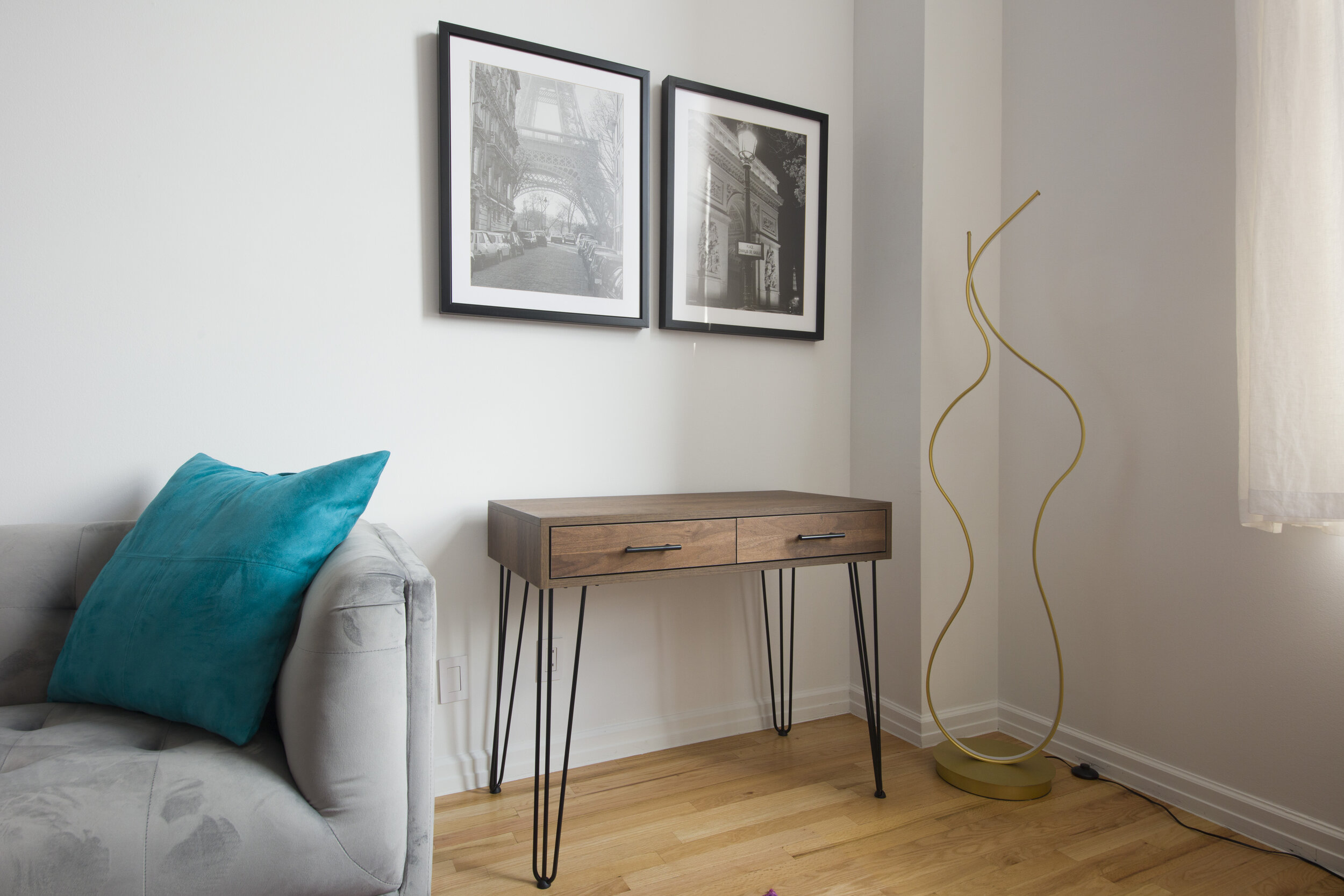
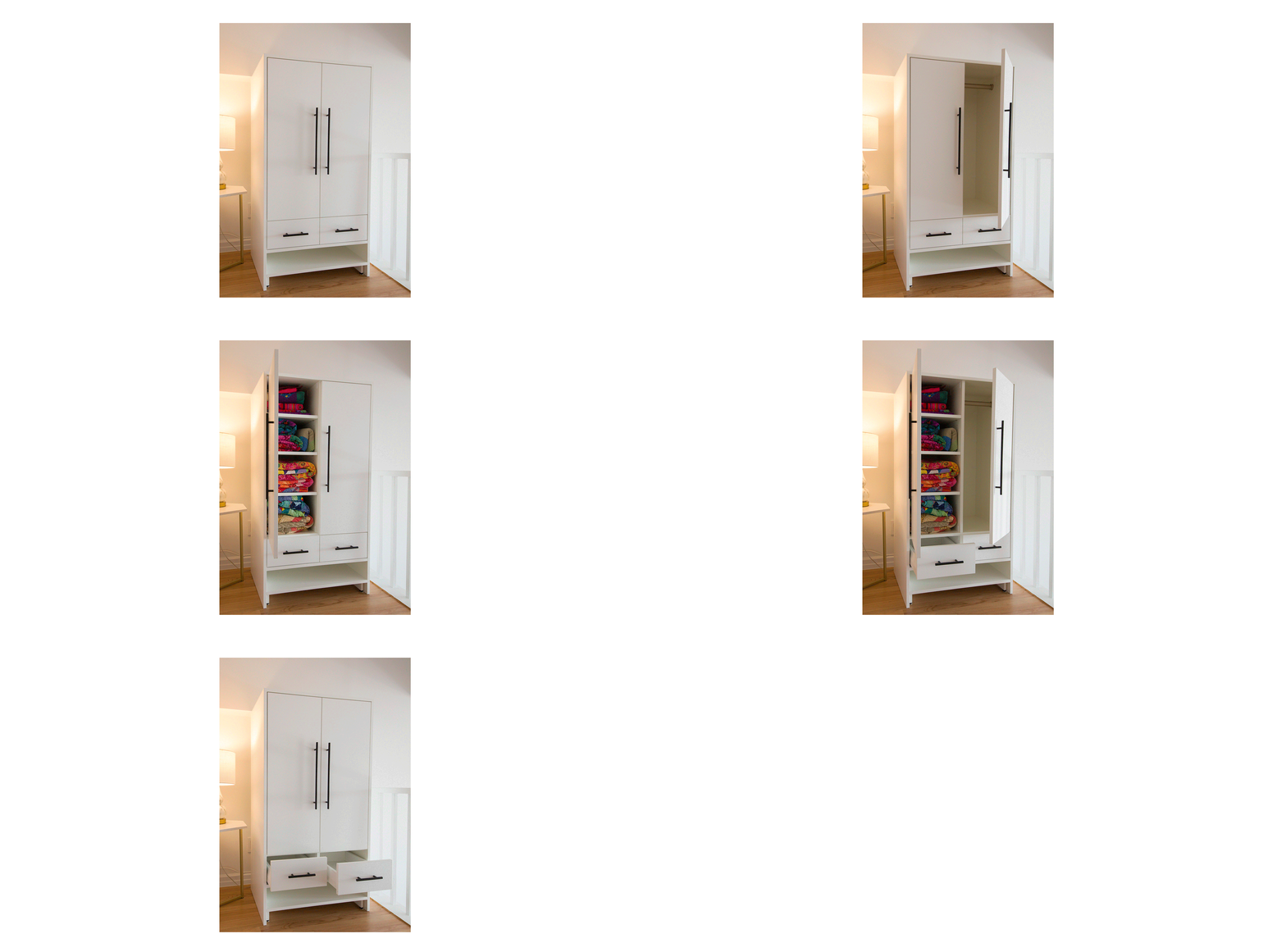
Art Direction - render, lifestyle, documentary


